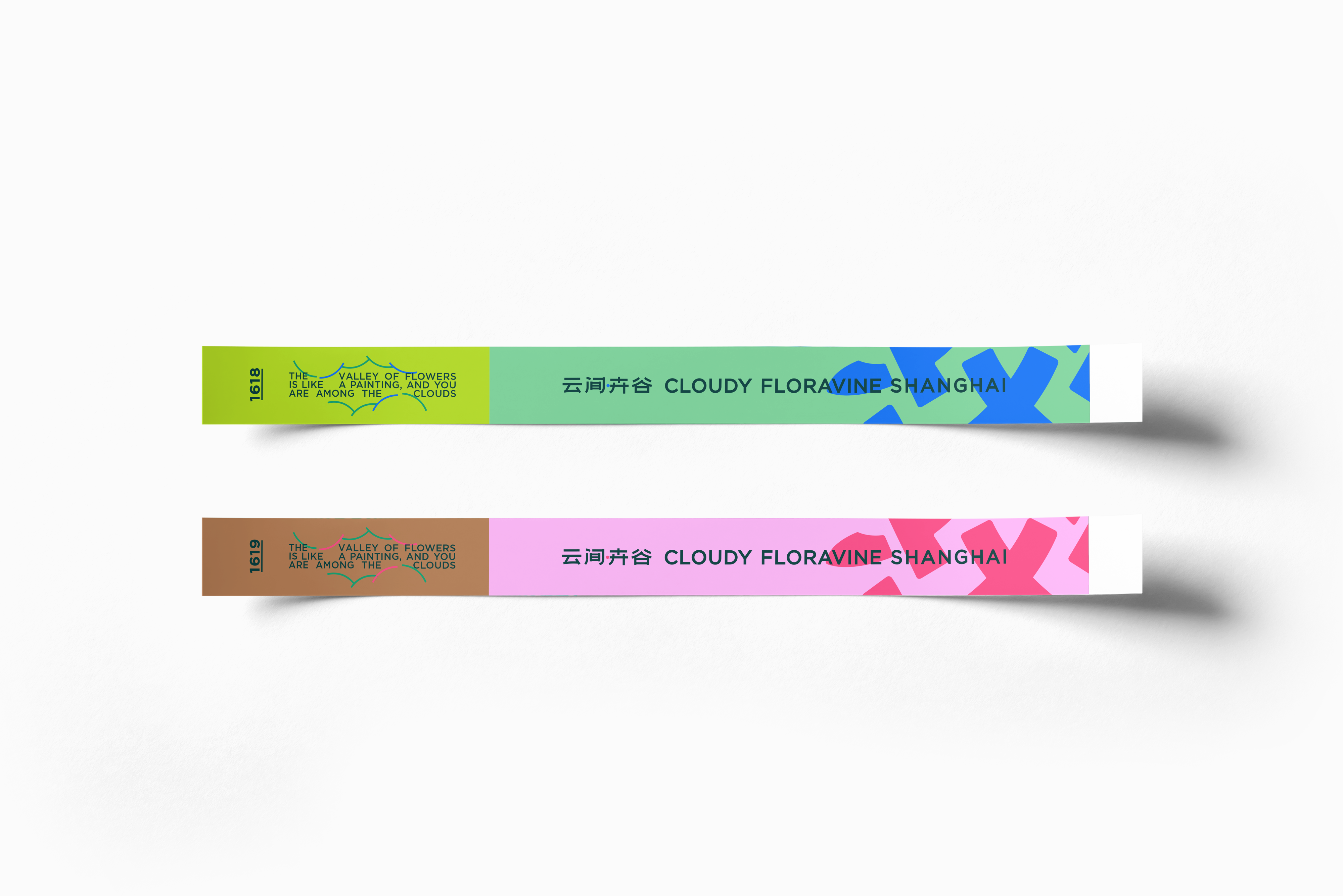
云间卉谷
ART DIRECTOR: Bowen Hou
DESIGNER: mushroom ahead team
YEAR: 2024
LOCATION: Shanghai
CLIENT: 云间卉谷
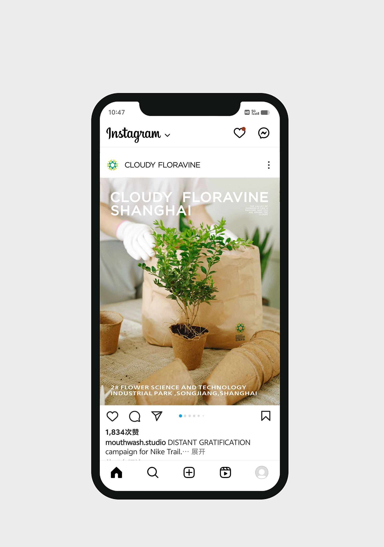
Yunjian Huigu, a horticultural industrial park located in Shanghai's Songjiang District, is dedicated to becoming China's premier hub for the entire flower industry chain. At the pivotal stage of initiating its systematic brand development, the client entrusted us with upgrading its visual system to better align with the keywords of internationalization and modernity.
Germination seems to be a critical process in the growth of all plants, symbolizing the courage to break through the soil and the hope of flourishing life.
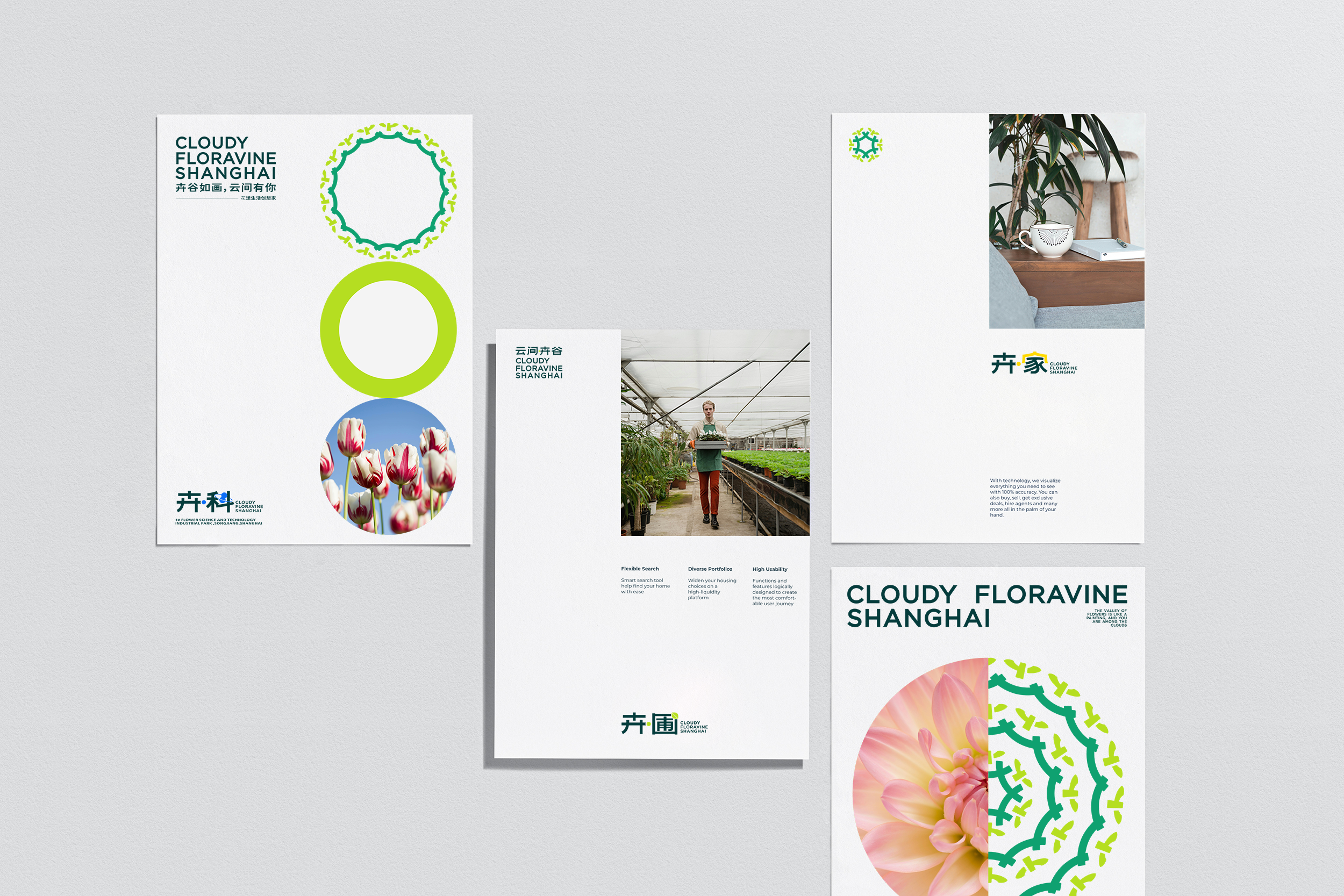
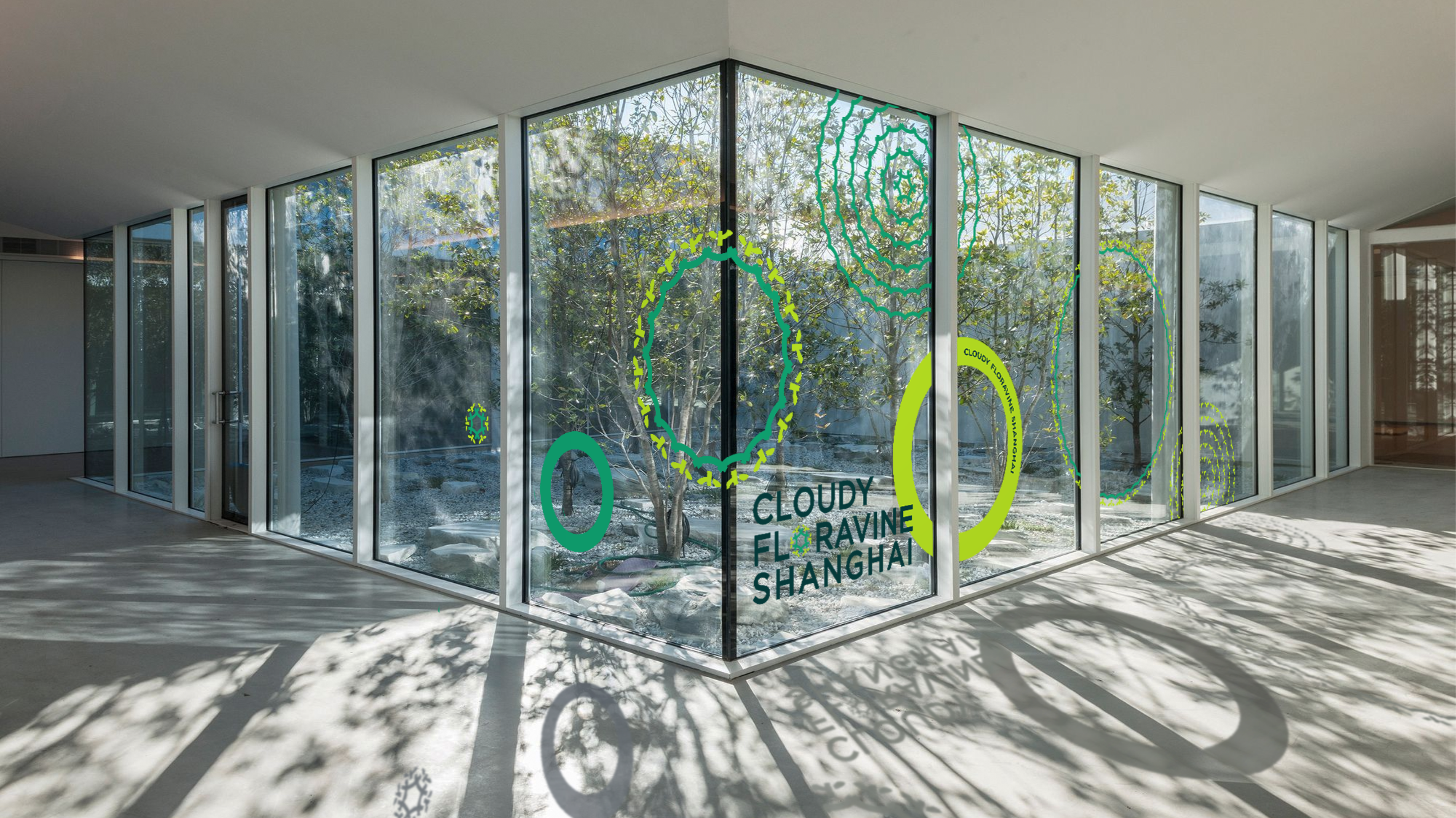
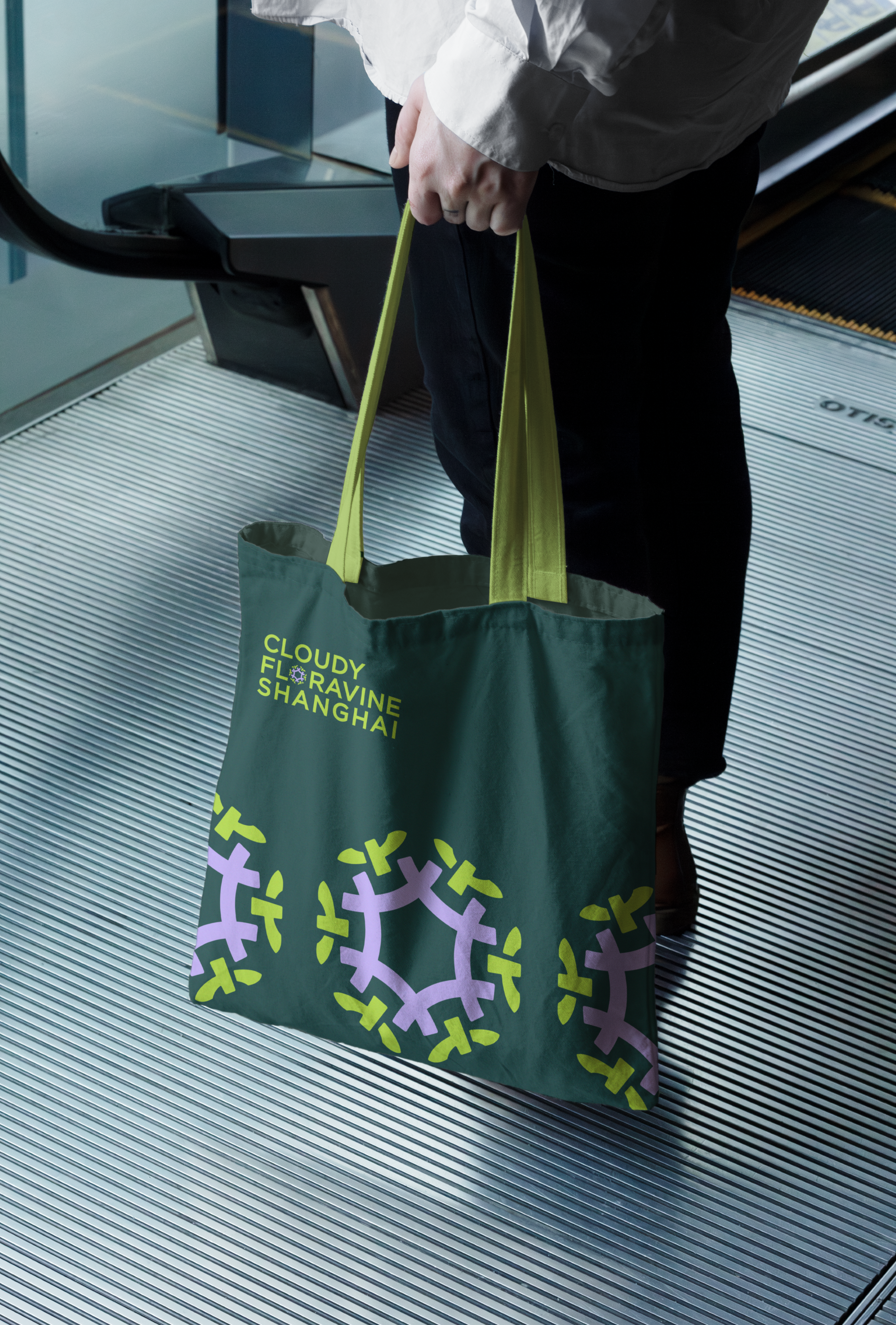
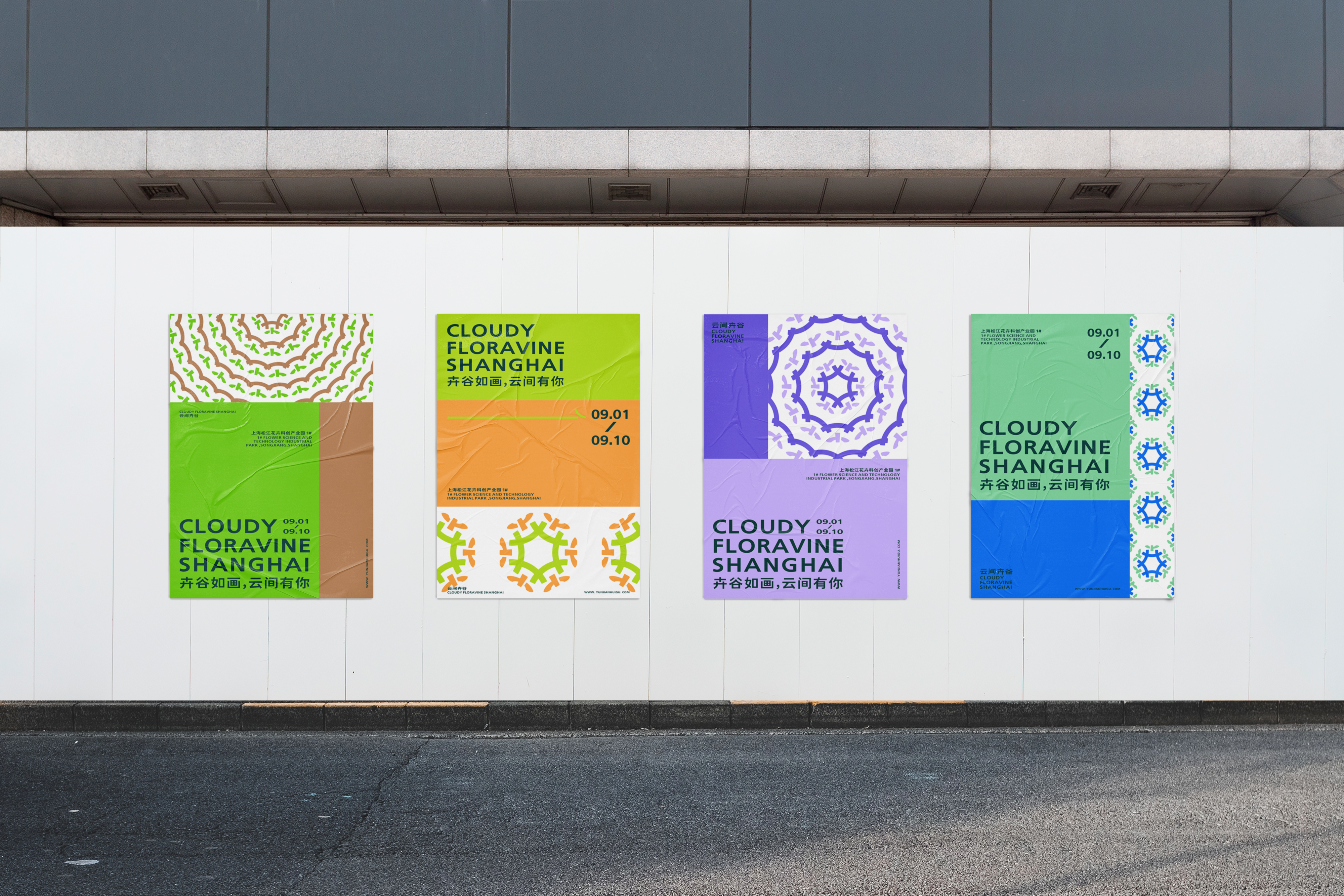
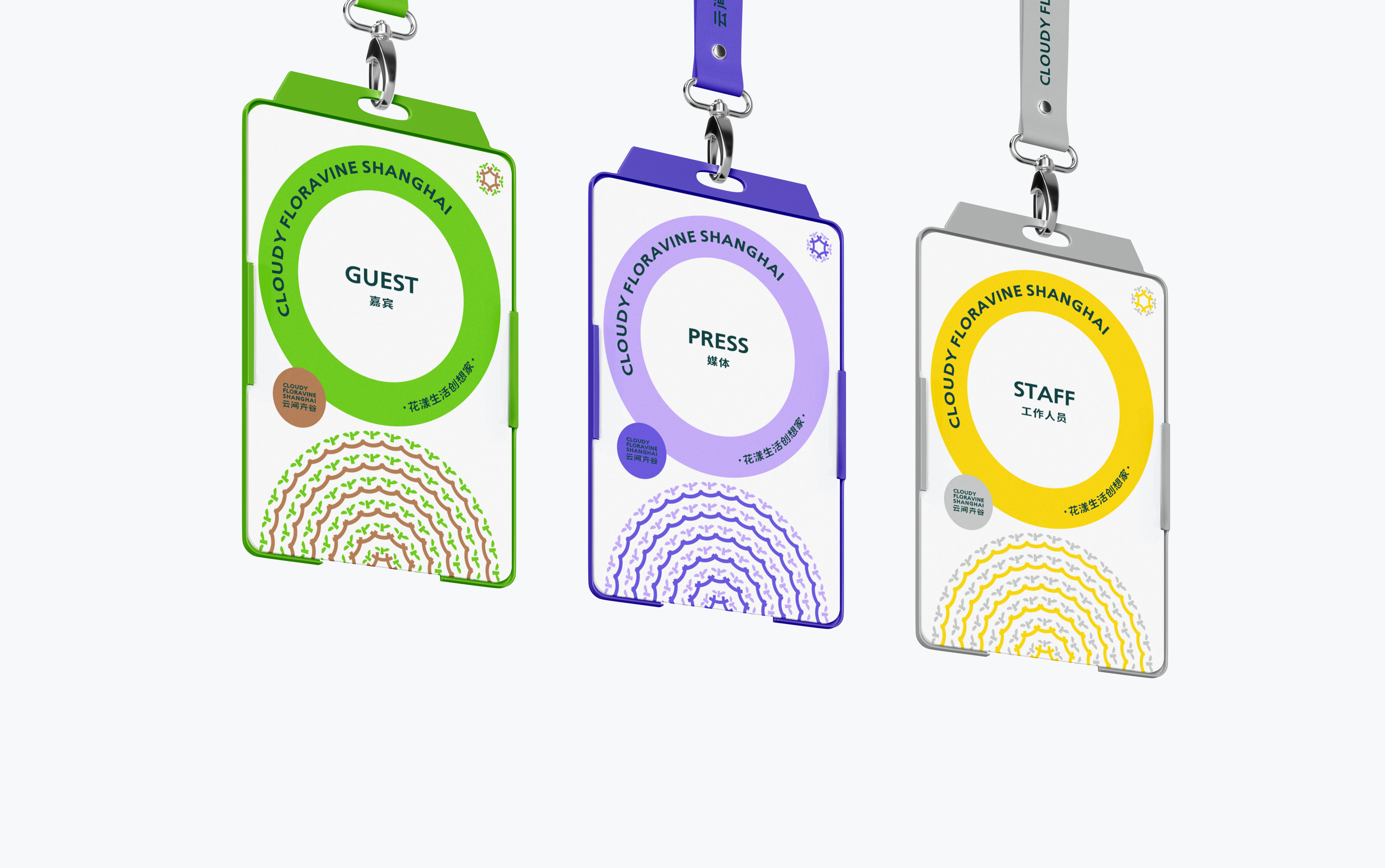
We transformed the cross-shaped structure of the Chinese character "卉" (huì) into a stylized sprouting motif. This graphic immediately communicates the brand's industry attributes and values. The six "卉" units represent the park's six core business sectors. The character's strokes—one horizontal and two vertical—were refined through iterative design: simplified for enhanced cohesion and abstraction, while carefully balanced to maintain legibility. Thus, this floral pattern invites limitless interpretation.
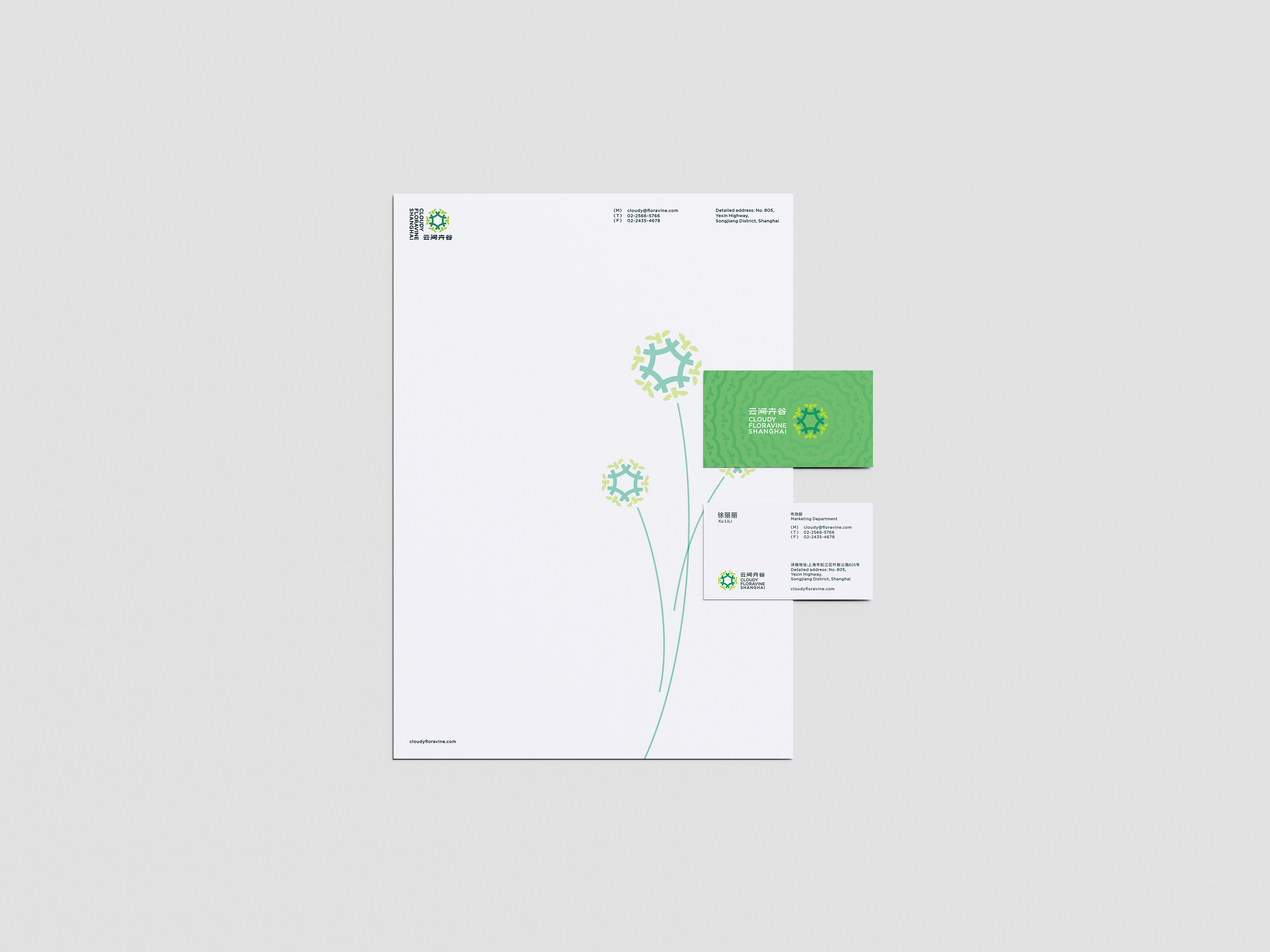
A seed sprouting in Pu'nan, carrying the dream of blossoming, roots deep and grows upward—where plants thrive and all life awakens in spring.
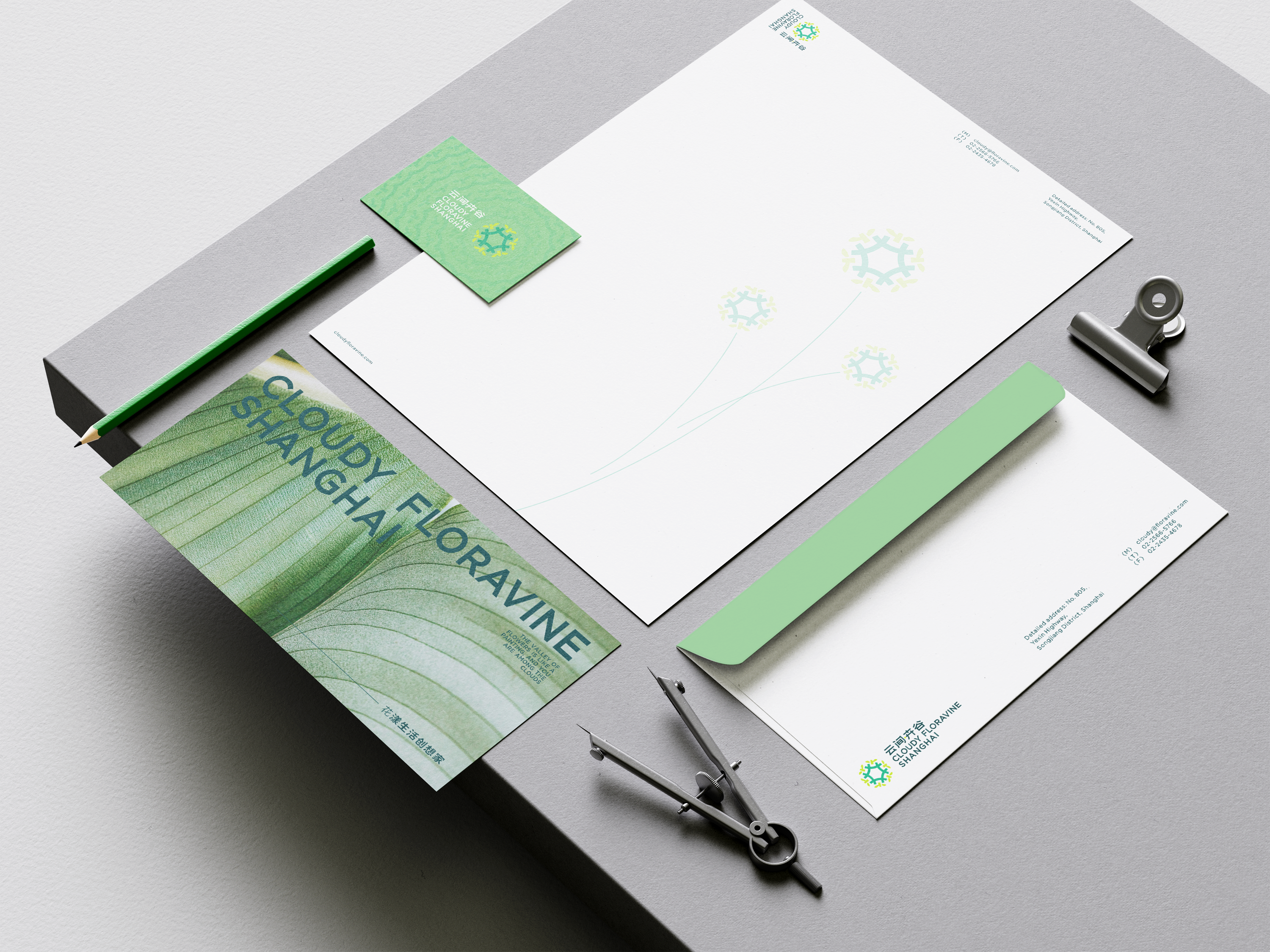
Beyond animating this brand-story seed, we embedded it within the "云间卉谷" logotype. From form to meaning, dynamic to static, the brand's visual language and narrative now form an open, inclusive design loop brimming with infinite possibility.
云间·卉谷是位于上海松江的绿植花卉产业园区,致力于发展成为中国花卉全产业链集聚地第一品牌。品牌方在开始系统布局品牌建设的节点,委托我们为视觉系统进行升级,以期更符合国际化与现代化的关键词。
萌芽似乎是所有植物生长过程中必经的一个关键过程,象征着一种破土而出的勇敢,一种蓬勃生长的希望。
我们将卉的十字做了一个萌芽图形化的设计,从图形含义先传达出品牌的行业属性和品牌价值观;六个卉字单元代表了云间卉谷旗下六大板块,卉字的一横两竖在图形设计的推敲演绎中,进行了概括化的处理,增强联结感的同时也更简约抽象,但也向保留阅读性做出了平衡与妥协。至此我们对这朵花形图案的解读可以展开无限想象。
一颗萌于浦南的种子,带着开花的梦想,向下扎根,向上生长,草木蔓发,万物春生。而这颗诉说着品牌故事的种子除了在动画中呈现,我们也把它安排在云间卉谷的文字LOGO之中。至此,从形到意,从动态到静态,品牌的视觉和故事形成了具有强开放包容性和无限想象空间的设计闭环。