At Hand
ART DIRECTOR: Bowen Hou
DESIGNER: mushroom ahead team
YEAR: 2025
LOCATION: Beijing
CLIENT: At Hand
"For a great cup of coffee, always at hand."
Visual Identity Upgrade for At Hand Coffee
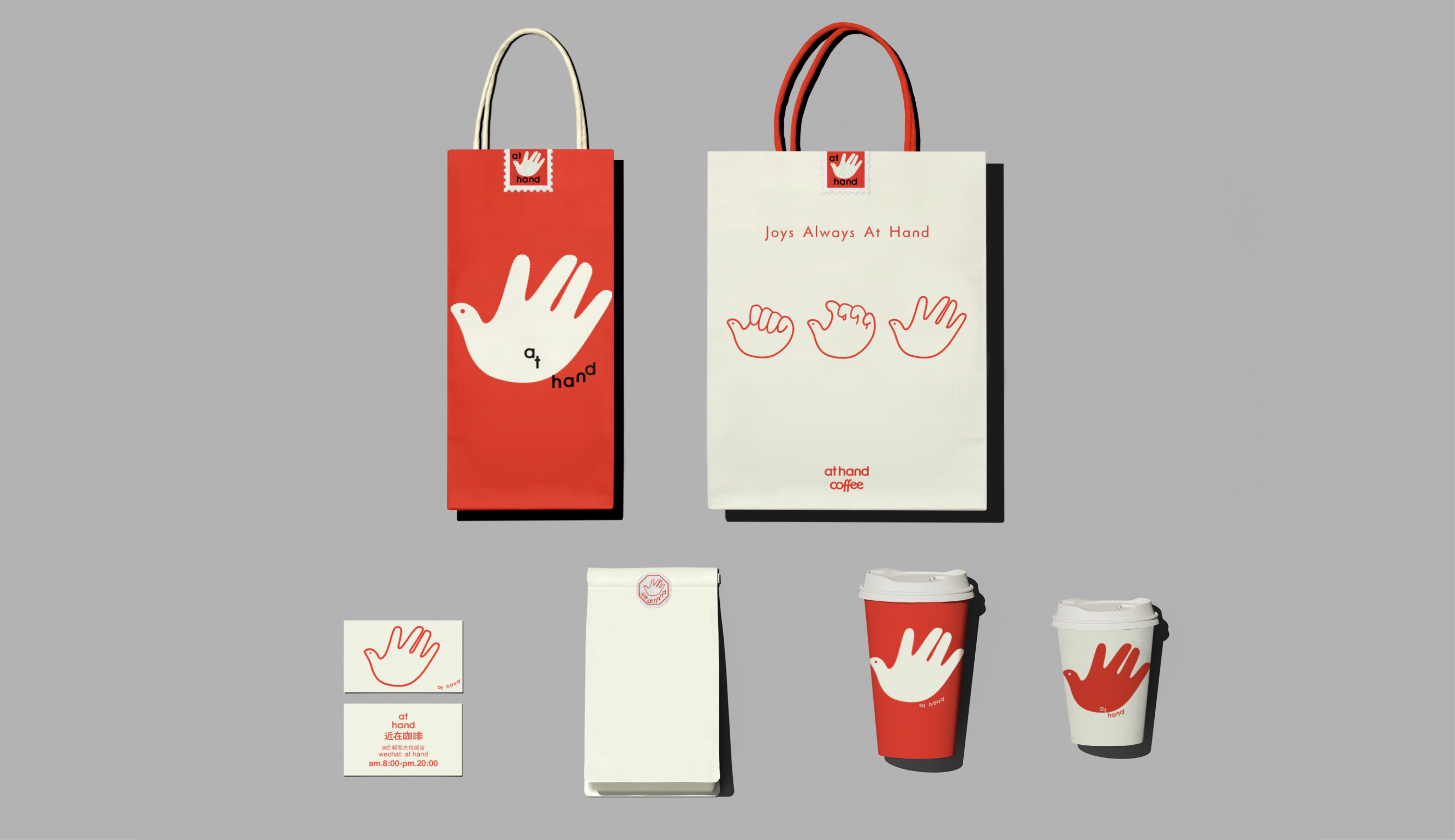
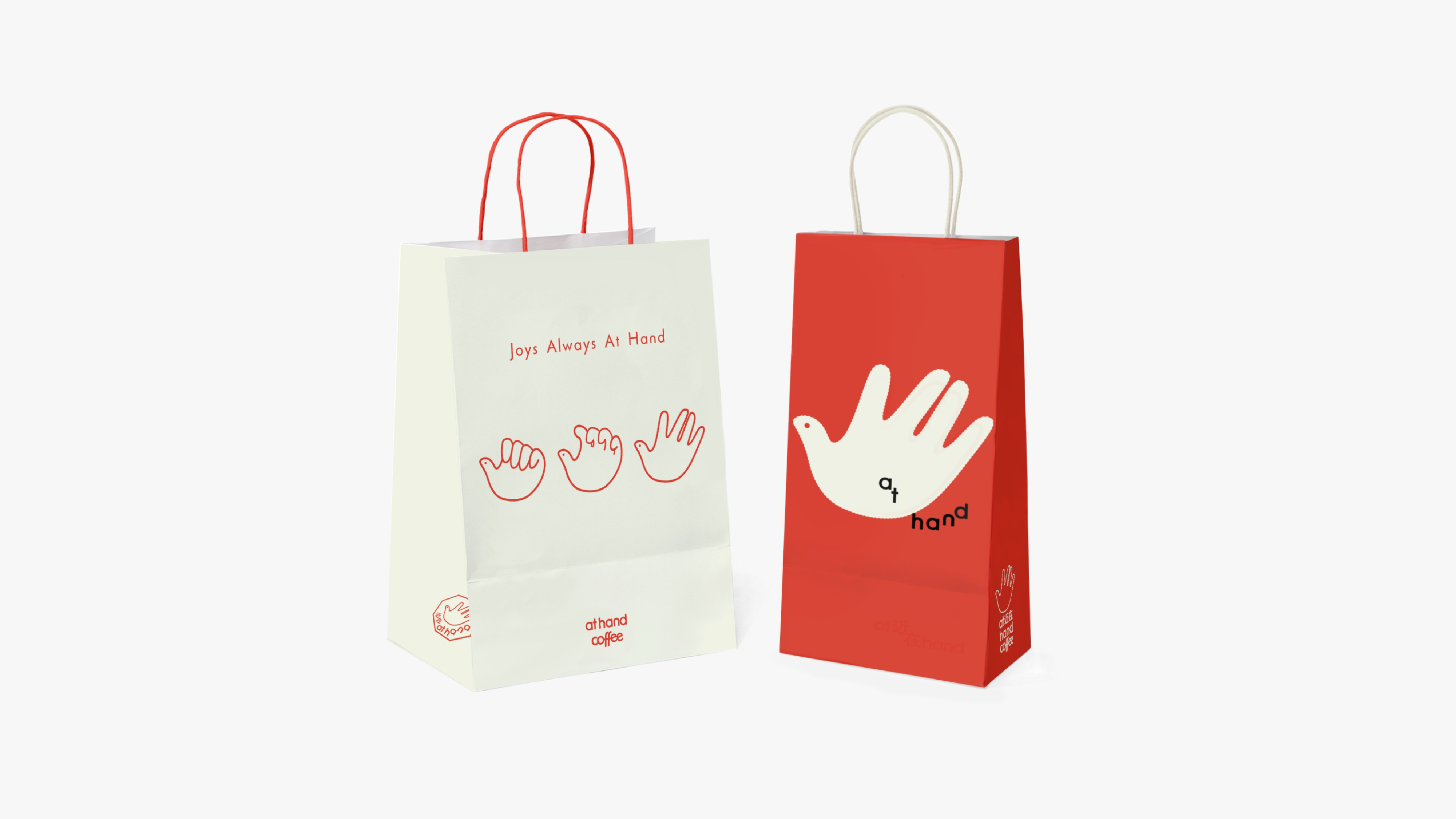
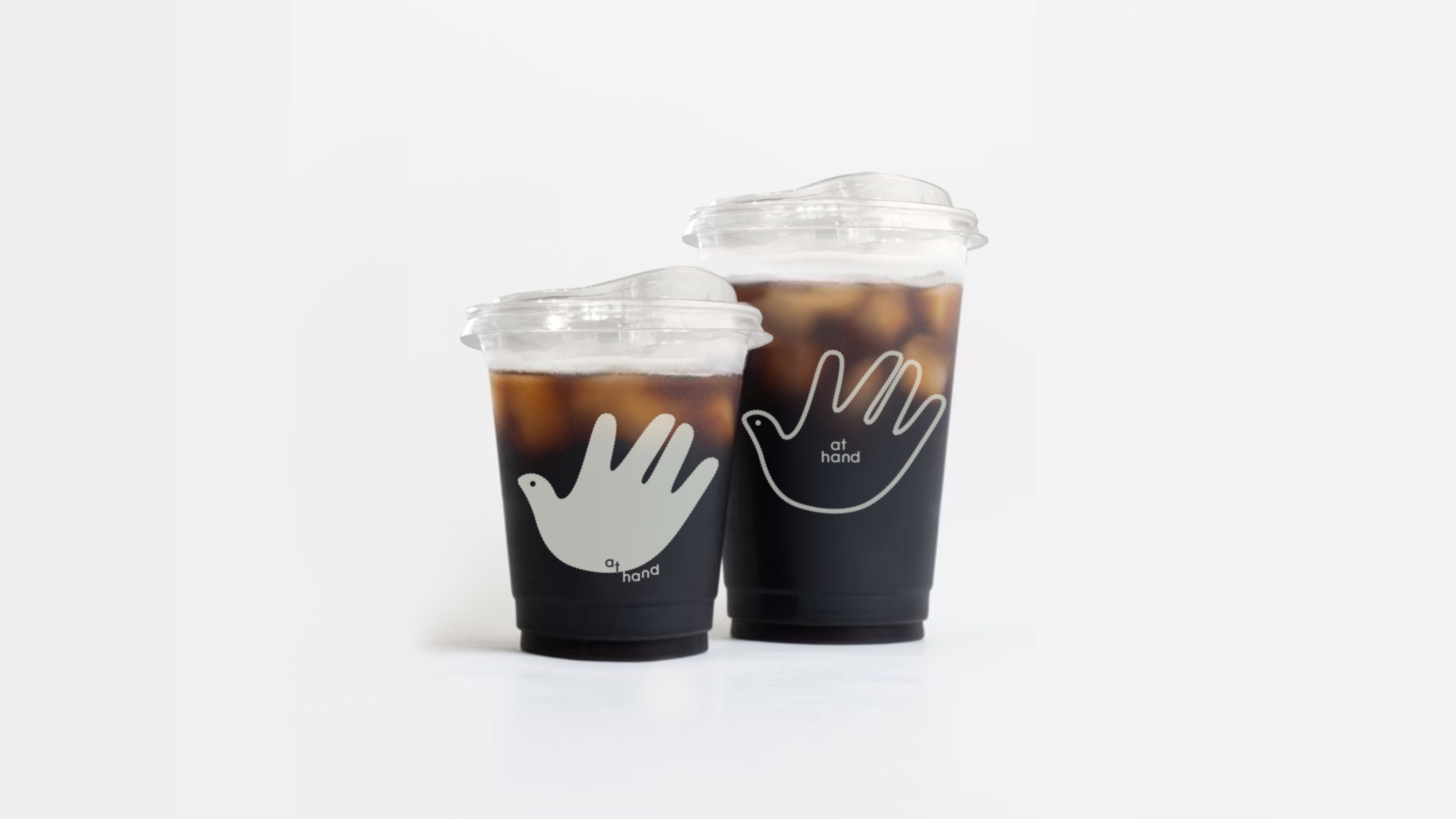
Built upon the word "hand" in the brand name,
we expanded visual impressions inspired by the concept of the hand.
By adding a defining accent to the thumb
and morphing the hand shape into a small bird,
we infused warmth and playfulness into the identity,
while strengthening secondary recall through dual perceptual interpretation.
The color palette draws from rich reds reminiscent of ripened coffee beans,
paired with an understated light bean-gray,
blending visual impact with refined sophistication.
The hand itself carries rich meaning—
giving, receiving, connecting, creating.
The brand has much to express;
design helps it speak.
Offering the coffee, holding the cup, savoring the moment—
delight is always within reach.
“为一杯触手可及的优质咖啡”
At hand coffee品牌视觉升级
以品牌名称中hand为基础
发散「手」的视觉元素印象
通过对大拇指上的点睛处理
以及将手型演化为小鸟
增加亲切活泼感的同时
在两种图形认知切换之间强化二次记忆
色彩盘选用联想到成熟咖啡豆的红色
搭配内敛质感的浅豆灰色
视觉张力和高级感得以融合
手的本身含义丰富
给予、接收、连接、创造
品牌想说的很多,
用设计帮品牌讲话
递出咖啡 捧杯享受 愉悦触手可及
At hand coffee品牌视觉升级
以品牌名称中hand为基础
发散「手」的视觉元素印象
通过对大拇指上的点睛处理
以及将手型演化为小鸟
增加亲切活泼感的同时
在两种图形认知切换之间强化二次记忆
色彩盘选用联想到成熟咖啡豆的红色
搭配内敛质感的浅豆灰色
视觉张力和高级感得以融合
手的本身含义丰富
给予、接收、连接、创造
品牌想说的很多,
用设计帮品牌讲话
递出咖啡 捧杯享受 愉悦触手可及