CAKE MONSTER 小罐兽
ART DIRECOR: Bowen Hou
DESIGNER: mushroom ahead team
YEAR: 2023
LOCATION: Hangzhou
CLIENT: YIMING
Yiming milk cancake, as the main online product of Yiming, has sold more than 2 million cans and is the number one selling product of its kind on the whole network. 2022 we are redeveloping and completely upgrading our brand, products and packaging containers with the new image of "CAKE MONSTER".
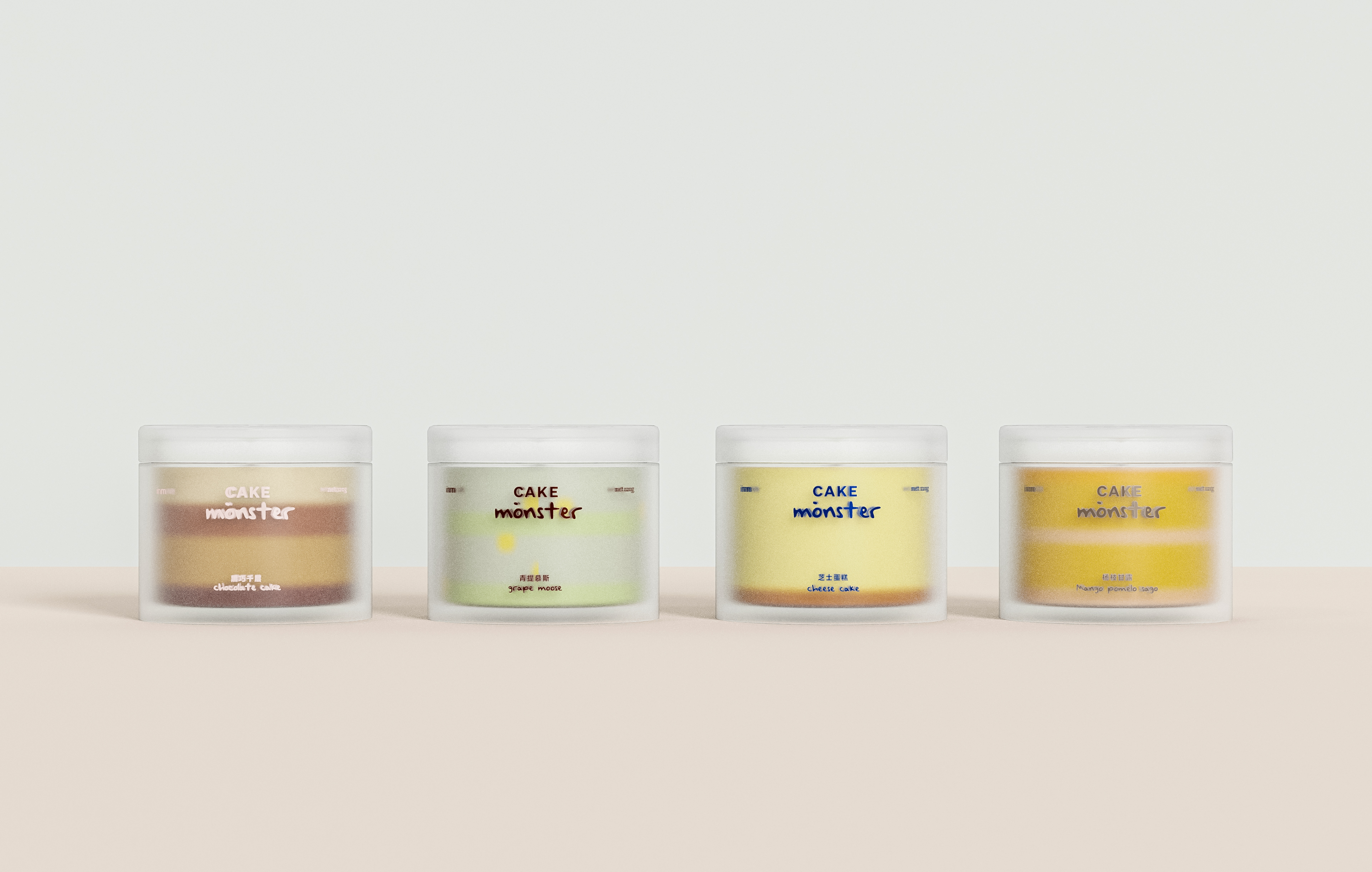
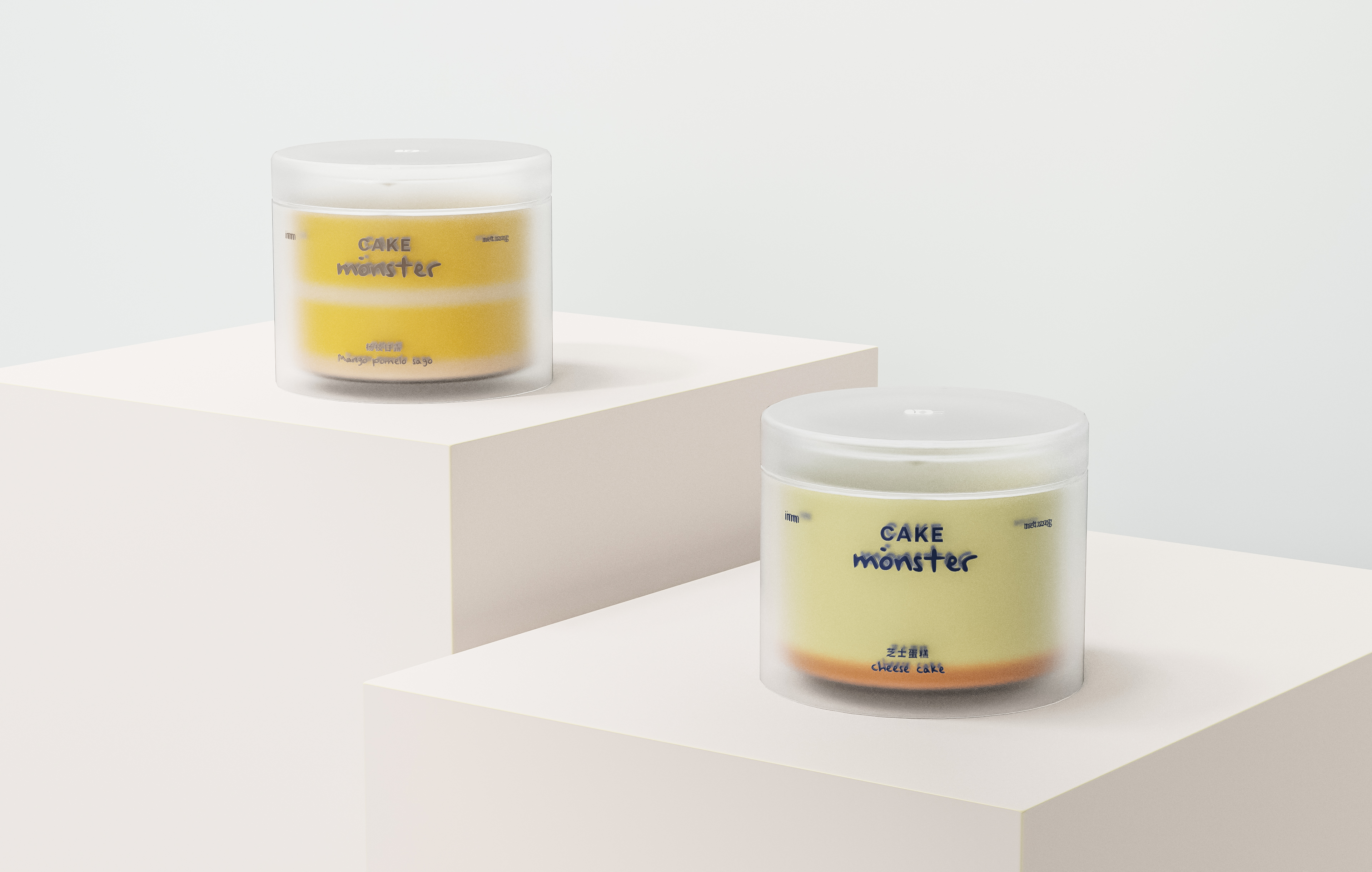
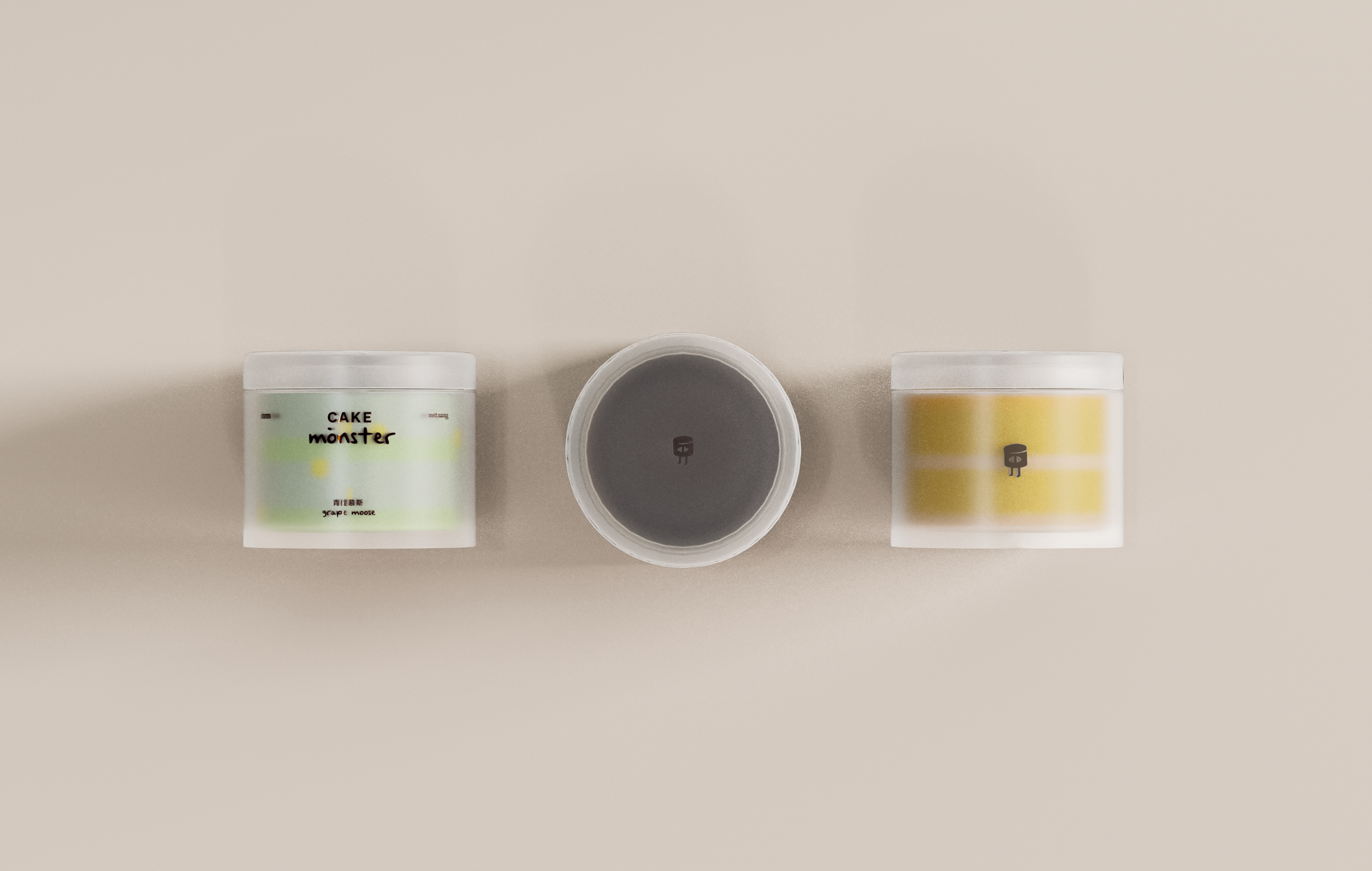
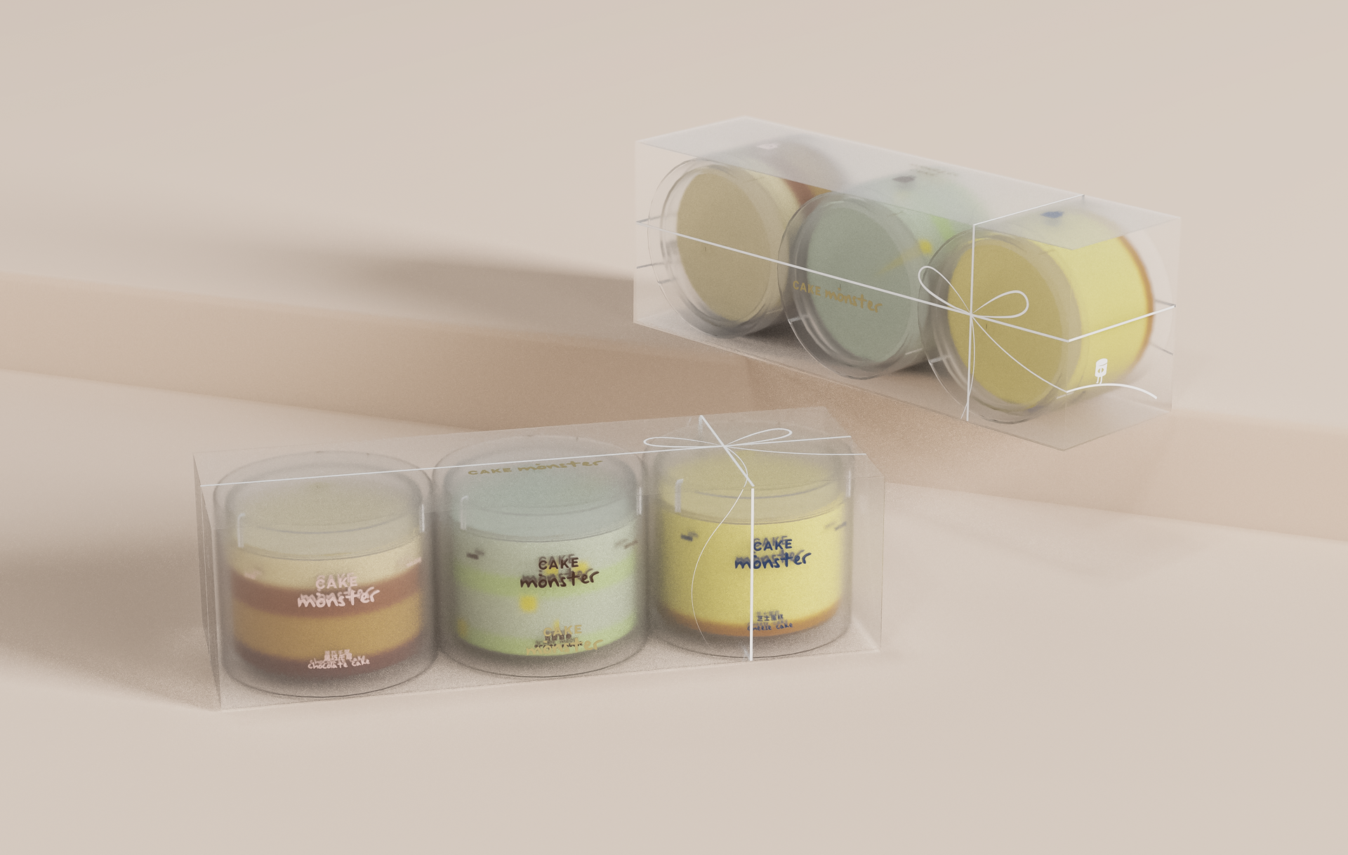
When canned food meets dessert: How to weaken the sense of "satisfying low needs" of canned food and strengthen the sense of "ceremonial enjoyment" of cake and dessert is the key to solving the visual eye-catching problem of this category. We decided to use the frosted texture as the basis, and then through the double-layer modeling design, to create a cake packaging design with a sense of airiness/home decoration, to evoke the user's association with the canned cake and dessert enjoyment scene from the first glance.
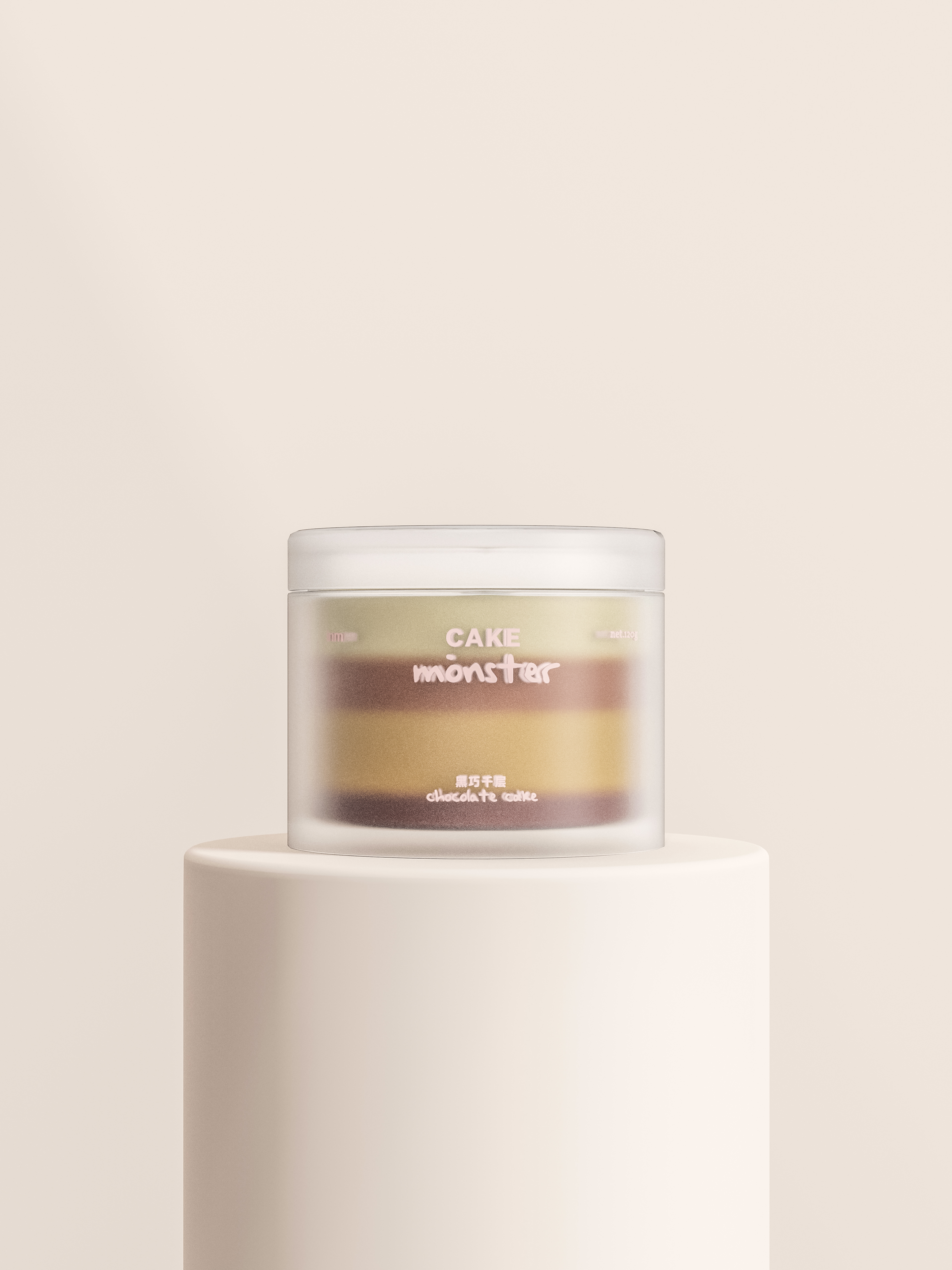
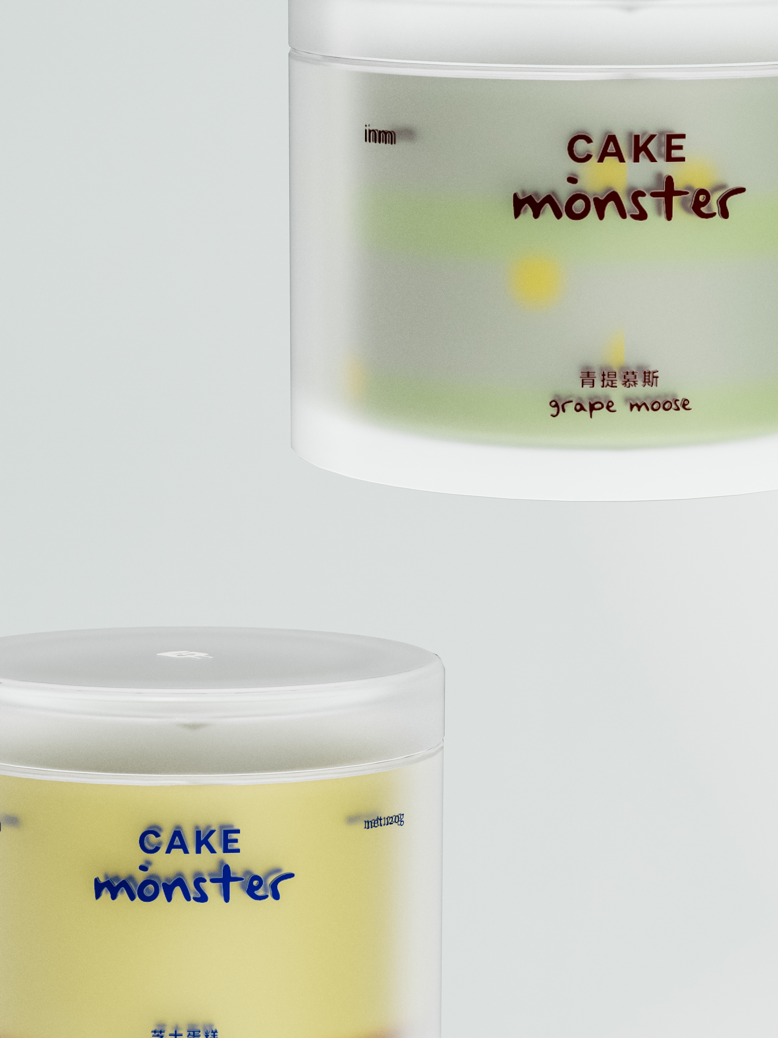
The handwritten font with graffiti logo creates a relaxed and trendy French dessert atmosphere. The transparent frosted container combines the texture and color of the cross-section of the cake itself, returning the canned cake to the essence of dessert through what appears to be an "undesigned" approach, while the hand-drawn canned one-eyed beast graphic logo is the finishing touch to the entire container.
The design of the whole project follows the principle of "less is more", form follows function, and the product (cake) is also integrated as part of the visual output of the design, which complements the design of the vessel, reinforcing the advantages of the container packaging and achieving the overall sense of "vision is IP". The design of the product (cake) also becomes part of the visual output of the design.
一鸣牛奶罐子蛋糕作为一鸣旗下的线上销售主打产品,已销售超过200万罐,全网同类产品销售第一。2022年我们以「CAKE MONSTER 小罐兽」的新形象,进行品牌、产品和包装容器的重新开发和全面升级。
当罐头遇上甜品:如何弱化罐头食物的“满足低需”感、强化蛋糕甜品品类的“仪式享受”感,是解决这个品类视觉吸睛的关键。我们决定以磨砂质感为基础,再通过双层造型设计,打造具有空气感/家居装饰感的蛋糕包装设计,从第一眼唤起用户对罐蛋糕甜品享受场景的联想。
手写体搭配具有涂鸦感的logo,营造轻松时髦的法式甜品氛围。透明磨砂的容器结合蛋糕自身的截面肌理与色彩,通过似乎“未设计”的手法,使罐蛋糕回归甜品的本质,同时衬托出手绘感罐头独眼兽的图形logo成为整个容器的点睛之笔。
整个项目的设计遵循“少即是多”的原则,形式追随功能,将产品(蛋糕)也融入成为设计视觉输出的一部分,与器皿设计相辅相成,强化容器包装的优势,达成“视觉即IP”的整体感。
