PLANT CHOISE
ART DIRECTOR: Bowen Hou
DESIGNER: mushroom ahead team
YEAR: 2025
LOCATION: Hangzhou
CLIENT: PLANT CHOISE
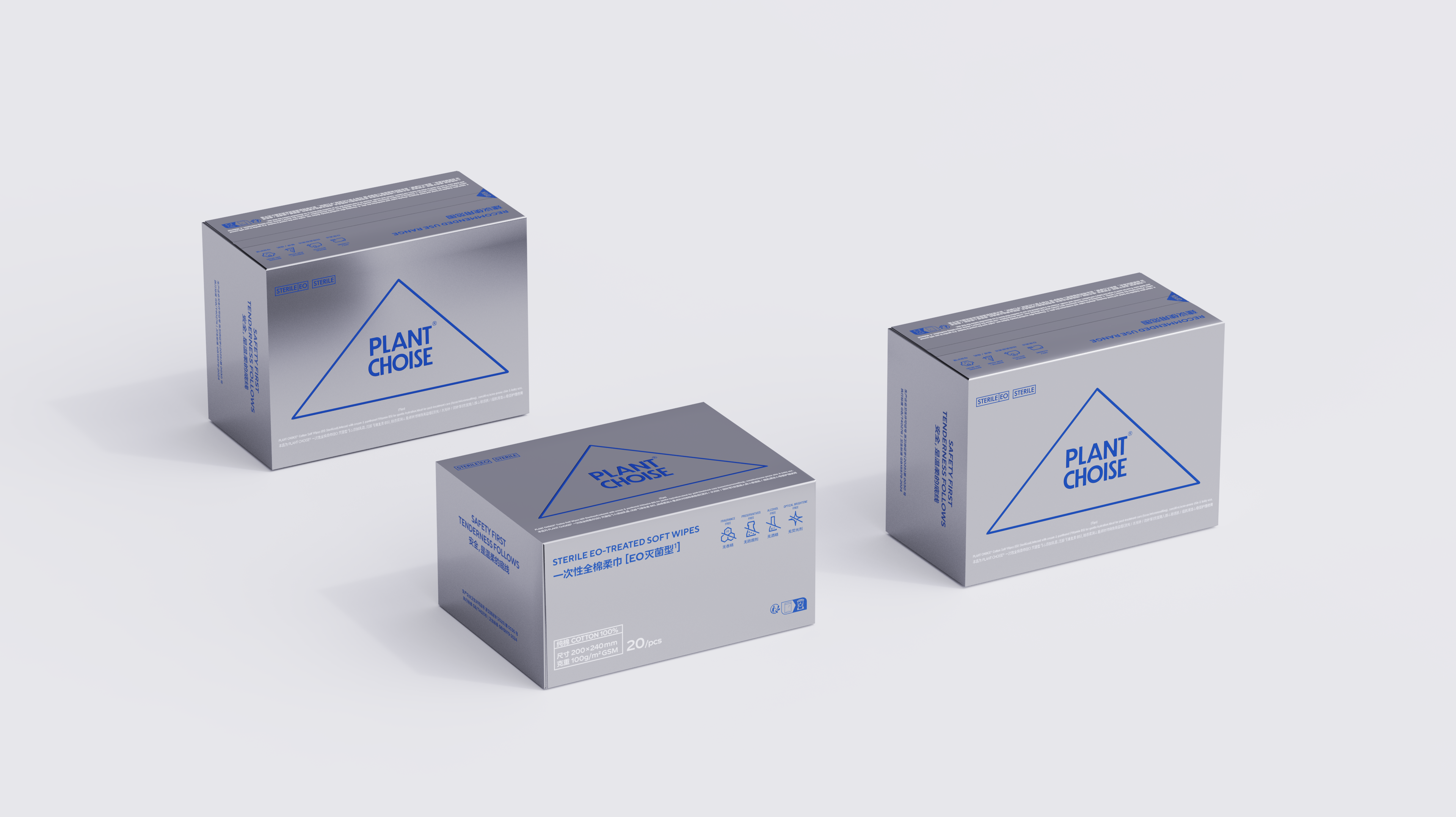
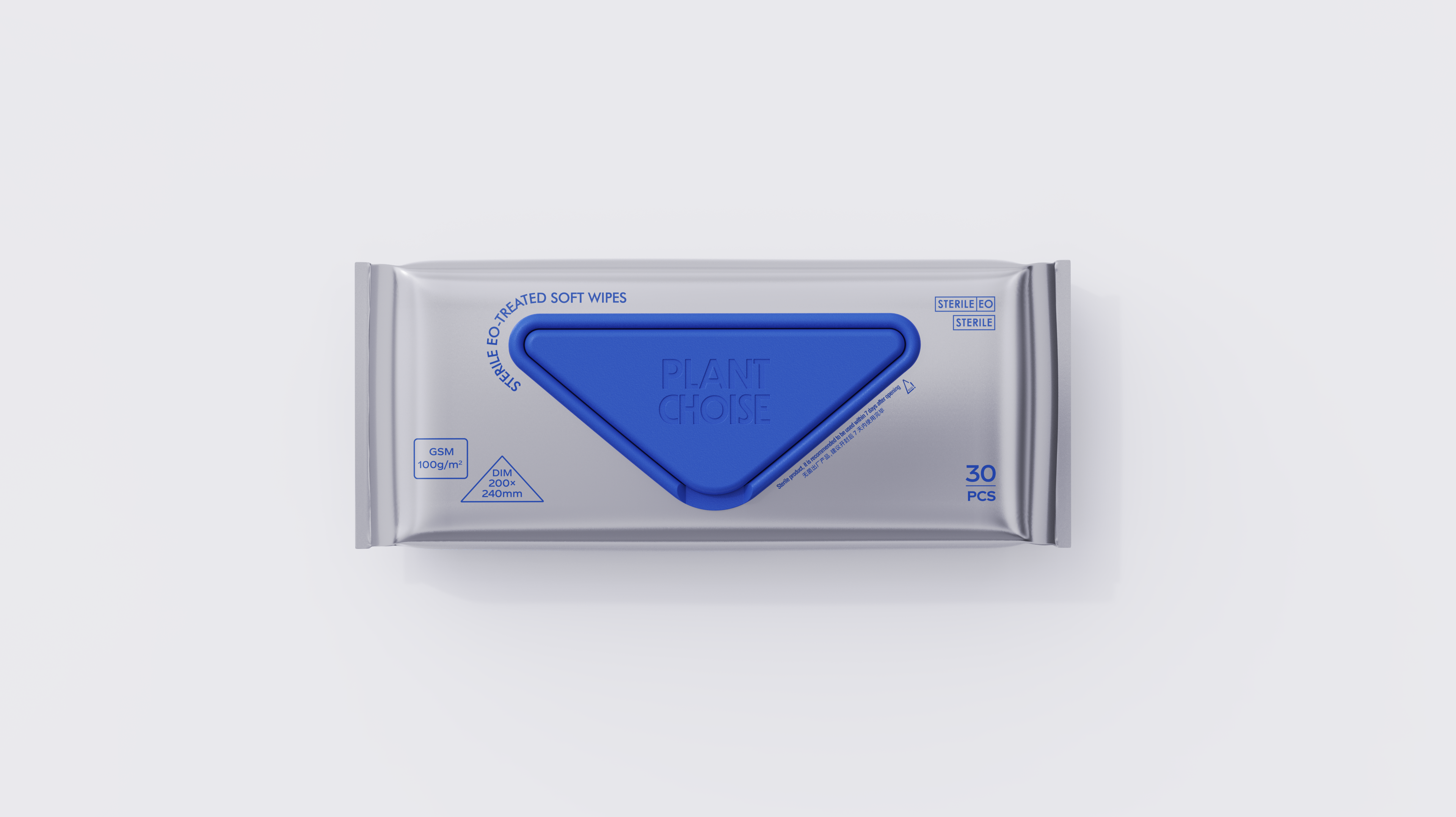
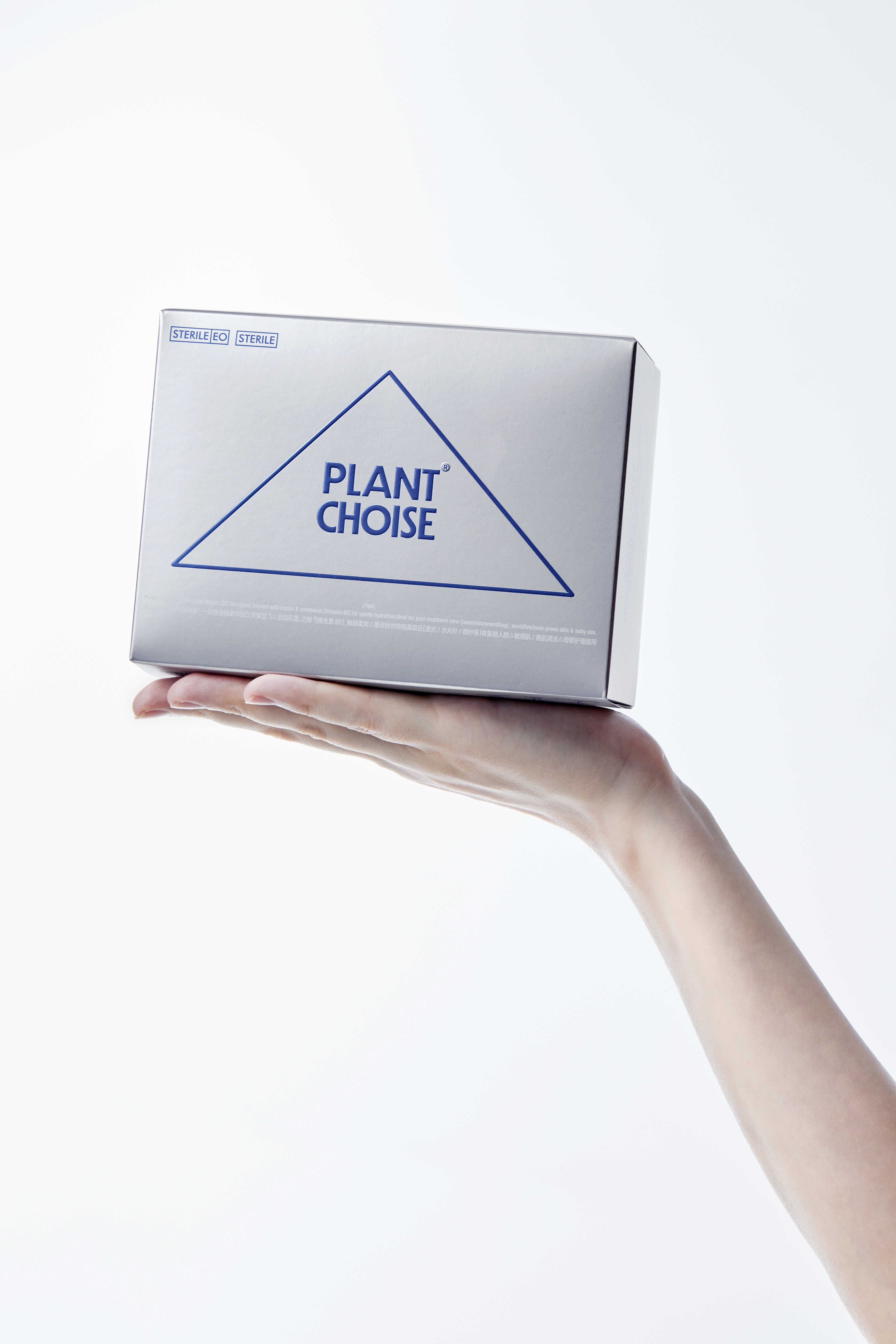
Comprehensive branding design for medical-grade personal care brand PLANT CHOICE. The stable triangular element forms a visual metaphor representing balance, humanity, and technology. Restrained visual language pairs with organic typography, creating a calm yet approachable tone. The contrasting silver and steadfast blue, along with a custom-designed icon system, ensure the brand values consistently extend across the entire packaging system.
医用级个护品牌PLANT CHOISE全案设计。稳定可靠的三角元素构成平衡|人文|科技的叙事符号,克制的视觉语言搭配有机的排版;冷静但有低姿态的基调,反差银搭配稳重蓝以及
专项设计的ICON系统,让品牌价值观得以在包装系统上延续